It makes complete sense that a jewelry brand would branch out into nail polish production—flashing hands to show off signet rings doesn't have the same effect with a manicure past its prime. When we last caught up with Jess Hannah Révész, the founder of J. Hannah, at her studio in 2018, she shared that the new category "started out as a joke." But it's been three years since our visit, and four years since the launch of their varnishes and J. Hannah's polish palette is steeped in a deep sense of style, taste, and curiosity.
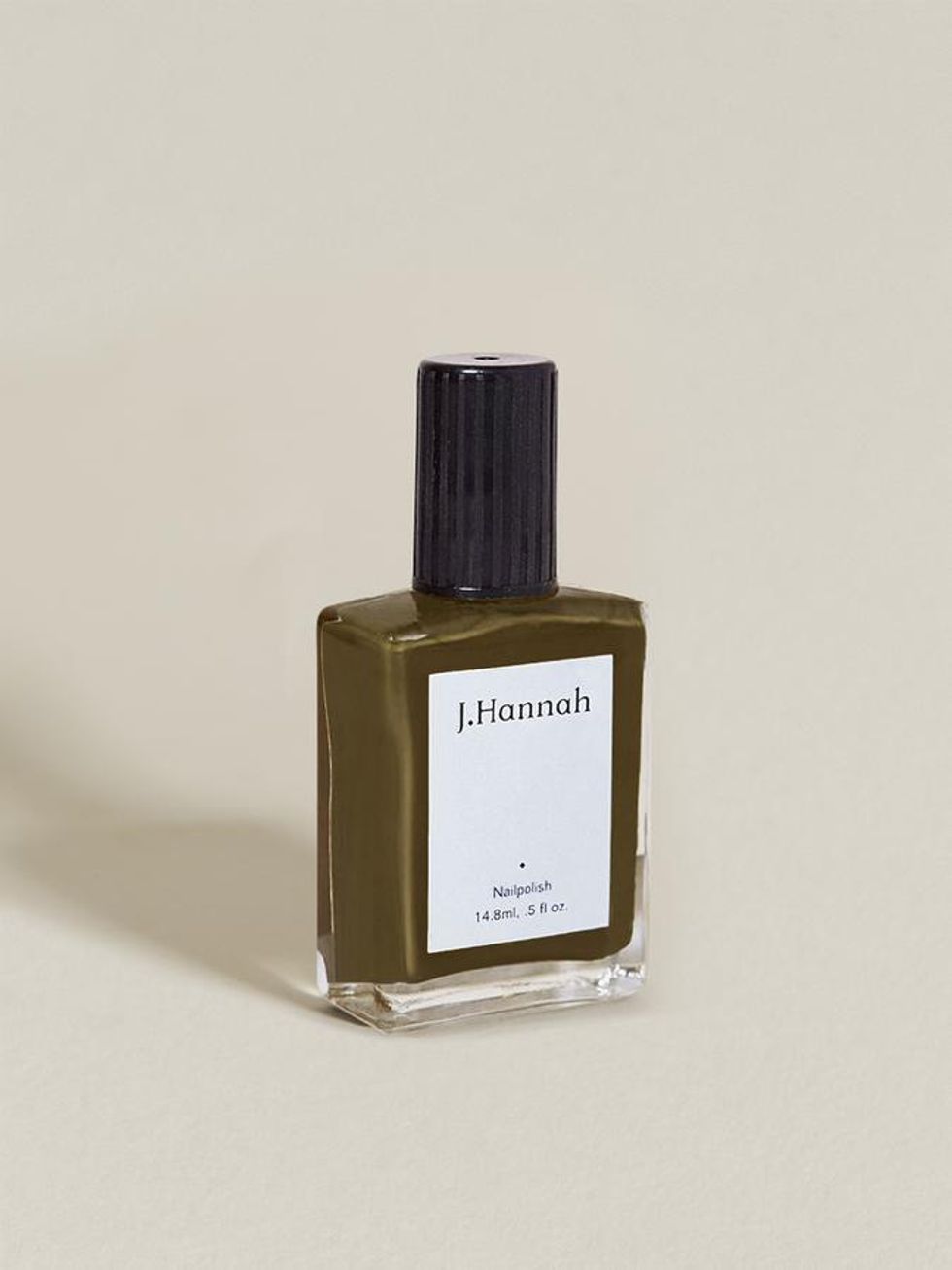
With that being said, none of their polishes evoke this more than Compost, a rich brown-green that joined their collection last summer, inspired by the shade that market researchers once christened the ugliest color in the world.
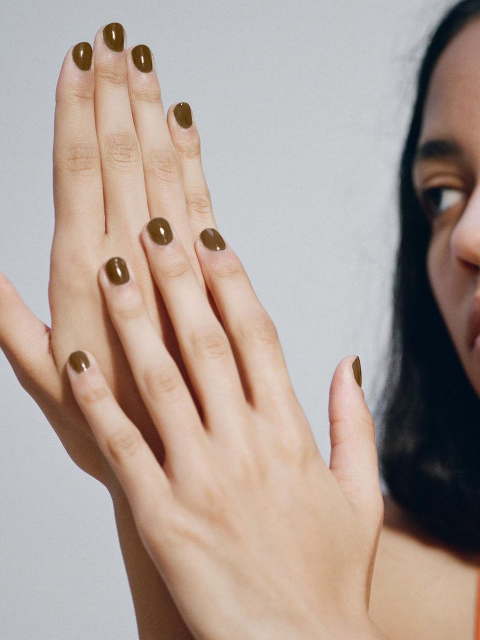
In an email, Révész explained to us that despite Pantone 448C's unpleasant reputation, "when we swatched the color, we actually found it quite chic," leaning into the French jolie laide (ugly beautiful) concept, which finds beauty in the grotesque.
In some respects, this makes the case for their color philosophy as a whole. "It's hard to underscore this point without resorting to cliche platitudes," she writes, "but to us it's a reminder that beauty really is up to the beholder to define; anything can be striking and hold intrigue if you take the time to look." Nail polish is often relegated as trivial minutiae—but it doesn't have to be. Compost is a prime example of J. Hannah quietly subverting what we classify as ugly and beautiful.
She recently told Vogue, "I am always thinking about color and I've learned that it's mostly context—i.e. texture, gloss, light, and other peripheral elements that inform the shade." Now, with a new trio of colors inspired by the Met's Surrealism exhibition, they're closing the year with a palette that offers a cooler take on traditional winter colors.
As we try to imagine what the upcoming season will look like, we tapped Révész for further insight on her approach to curating J. Hannah's palette and what she anticipates for 2022.
You told Into the Gloss that prior to creating your own, you felt that nail polish colors lacked nuance. How would you describe a nuanced polish palette? And how do you try to incorporate this profundity when selecting J. Hannah polish colors?
"My motivation for starting the polish line was that at the time, I couldn't find the colors I wanted —shades that felt both classic and unusual, complimentary to a wardrobe of mostly neutrals. At the time, all the pearly pinks and candy apple reds just felt too obvious. Our process has always been about identifying moments of subtly profound color and letting that lead the development process, whether it's a discernibly appealing reference, like a blooming flower petal or a specific painterly brushstroke, or something less explicitly beautiful."
With Compost being so popular, is Jolie Laide an ongoing conceptual reference point for future collections? If so, how is it going to manifest in upcoming drops?
"While we're not setting out to overtly design 'ugly' colors, we're definitely all-in on developing shades that come from a place beyond just choosing something that's easy and pretty — if something as tiny as a polish can hold the possibility to invite a little more curiosity and delight into life, why not? And now, when we see someone wearing a JH polish out in the world, it now feels like a bit of an 'if you know you know' moment. Our polishes aren't for everyone, but if you 'get it' it feels really fun and like an authentic source of connection."
What do you anticipate will be the popular polish colors of the upcoming season?
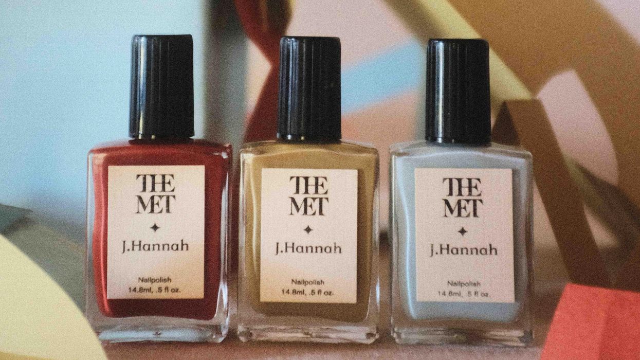
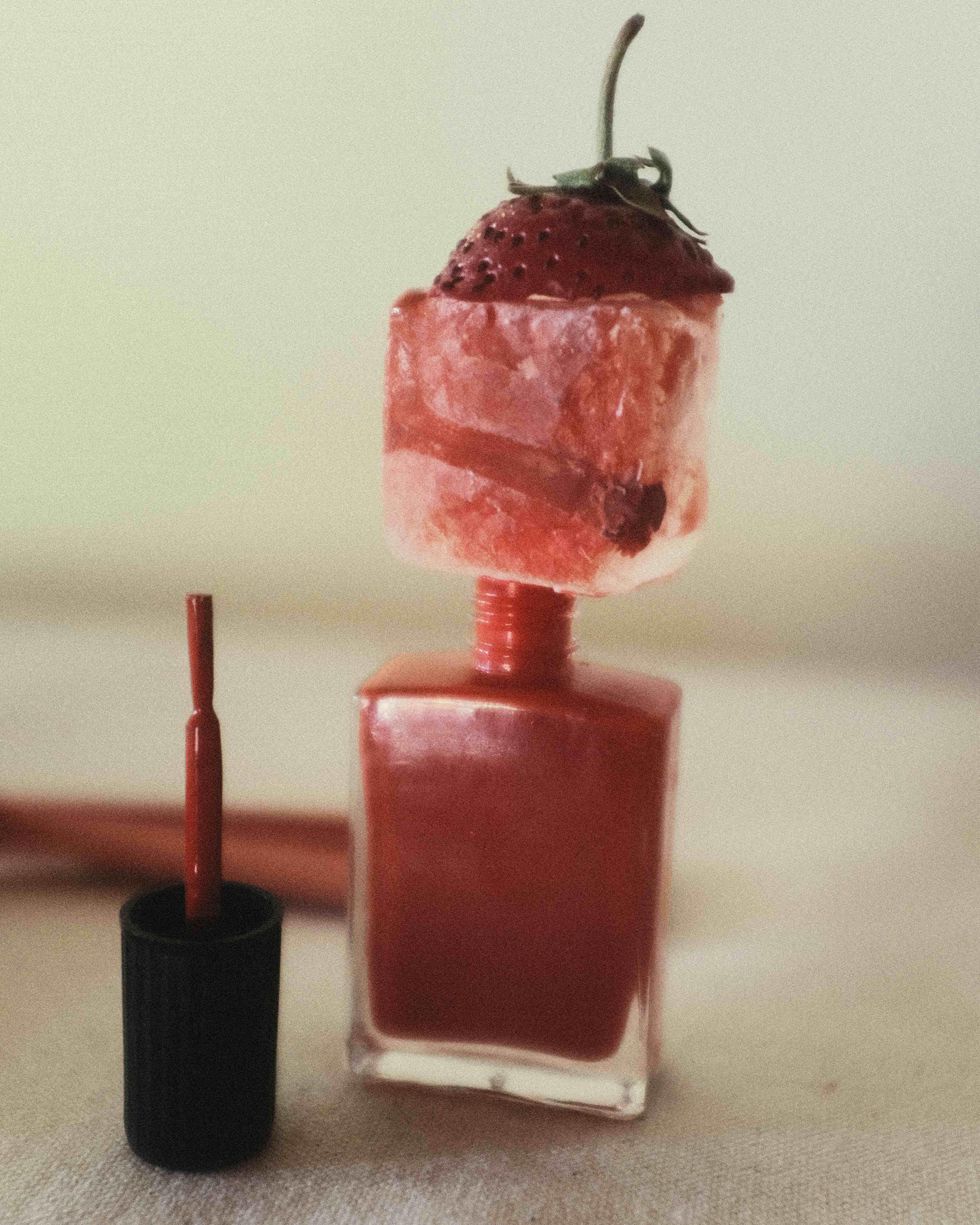
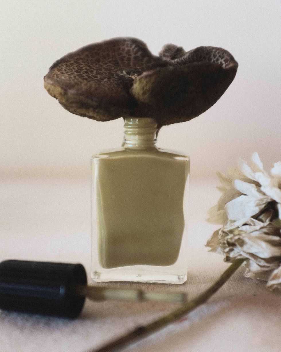
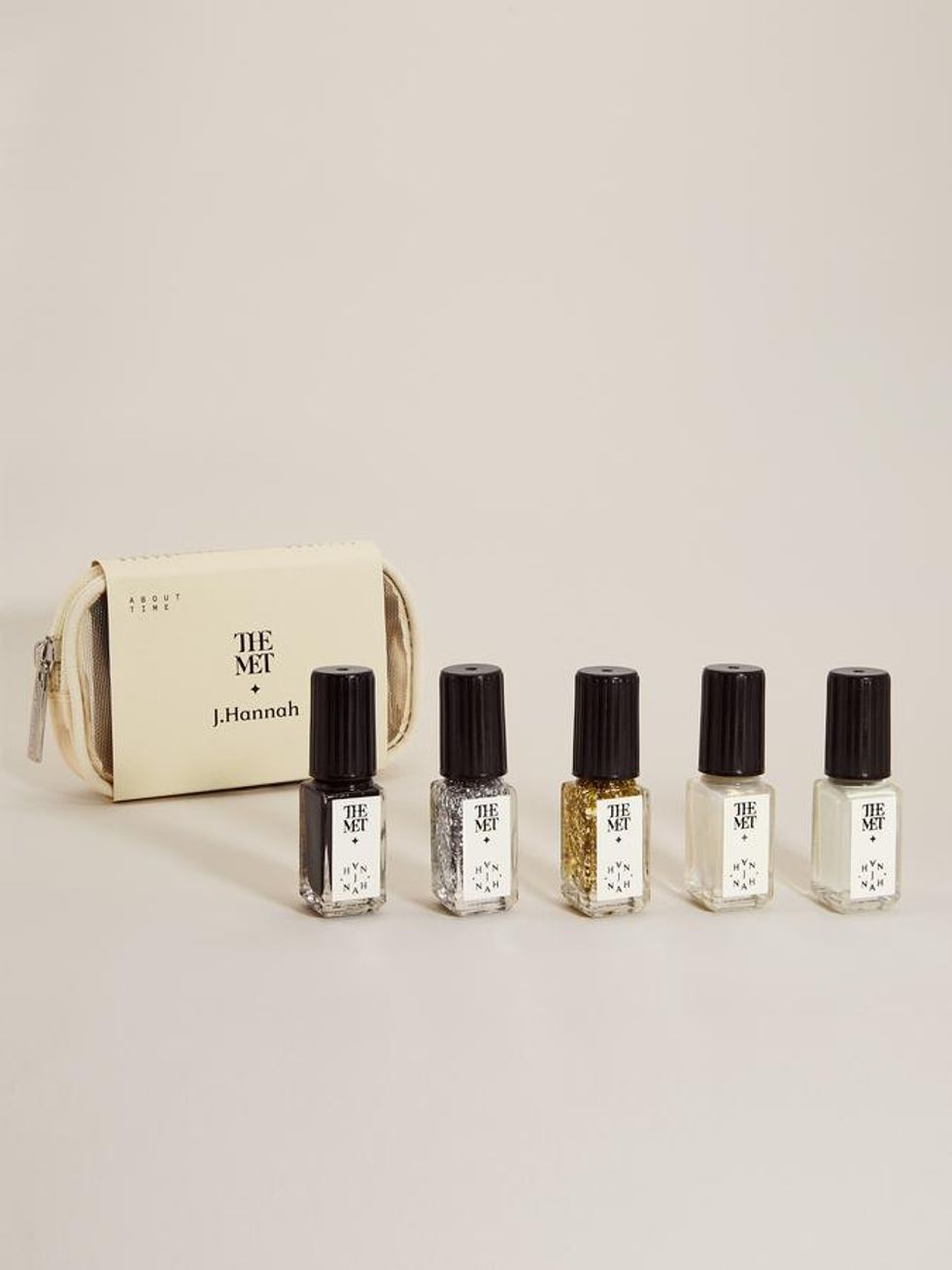
"This season we released a three-polish set in collaboration with the Metropolitan Museum of Art's exhibition, 'Surrealism Beyond Borders'. Inspired by some of Surrealism's iconic and symbolic motifs, the set includes a perfect faded tomato-red (Carnelian); a parchment green-beige neutral (Enigma); and an at-once bright and soft blue that references a rare, historic pigment (Prim). Both the red and the blue feel like the perfect holiday colors to me for right now—vibrant yet atypical twists on traditional winter shades."
Carnelian by J. Hannah
Enigma by J. Hannah
While we were confined indoors, it seemed that everyone was veering towards earthier hues to evoke an outdoor vibe. As you plan ahead with J. Hannah's 2022 palette, how are external elements (nature, news, etc) impacting your color selection?
"While our polish mood board is ever-evolving, right now our process for color selection has been primarily driven by ideas. In other words, starting from a concept and letting the color come from that rather than deciding to make a specifically earthy tone or a vibrant one. No spoilers (yet!) but our desks are stacked high with color theory references, science books, and poetry as our source materials for what's to come."
Shop the Story:

Photos: Courtesy of J. Hannah
Want more stories like this?
This Cult-Favorite Jewelry Brand Mixes L.A. Minimalism with French-Girl Chic
10 Holiday Nail Designs You'll Want to Wear All Season Long
Let Astrology Decide What Nail Design You Should Try Next