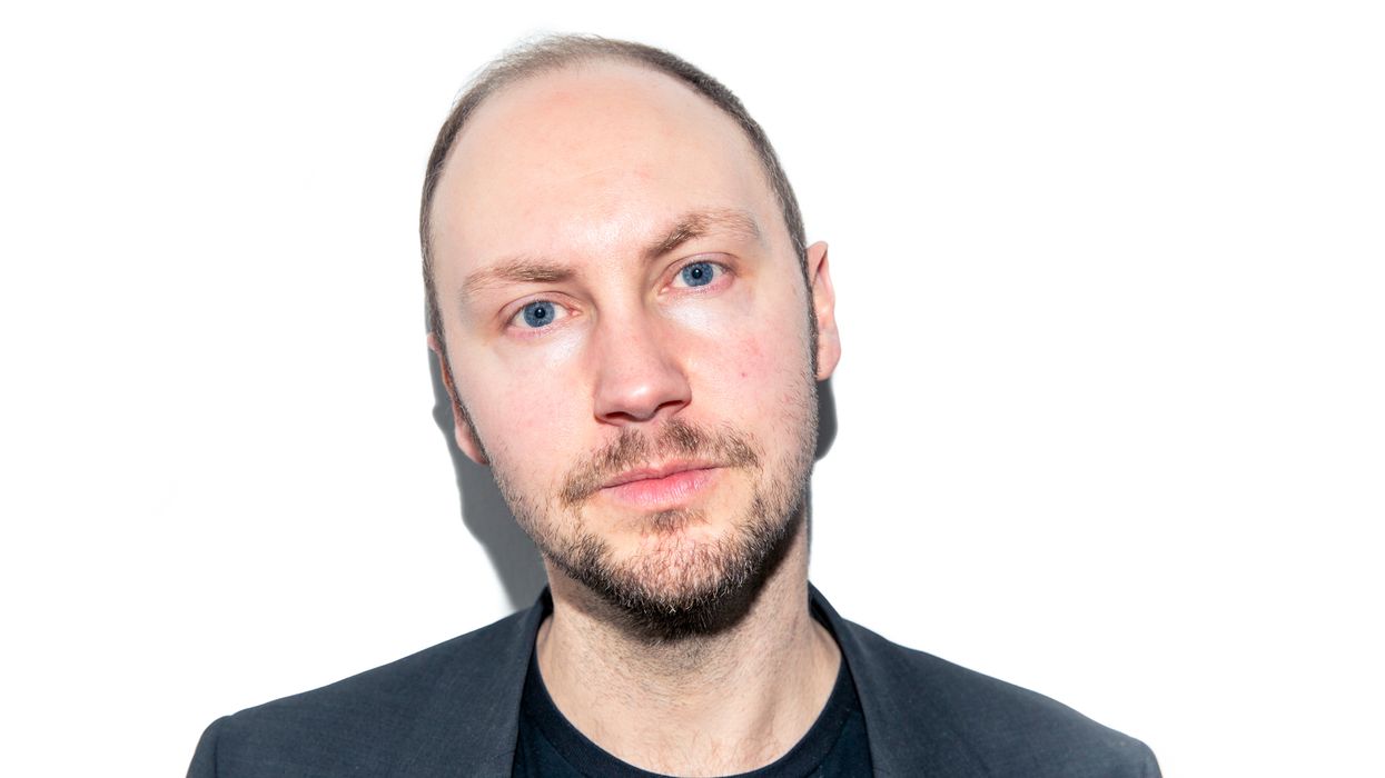
Tim Buol
Think about the power of a good logo. It evokes a feeling, embodies an ethos—it gives a brand a face in just a few (expertly and creatively) stylized characters of text. It’s no easy feat. That, we can say for certain. It takes a special kind of brain to craft something we’ve never seen before, and that’s why mega brands like Google, Calvin Klein, Aesop, and Nike, to name a few, have tapped Craig Ward. He’s imagined Equinox’s “Commit to Something” campaign, which is so permeable, you could probably picture it without even looking it up. So it was a no-brainer, when we decided to launch our own Coveteur merch, that we would ask Ward to help us imagine the design.
And just as we let our new garb into the world, we caught up with Ward one last time in his Manhattan studio to talk about his creative process, drawing inspiration from the city, and his advice to aspiring creatives in an ever-changing digital world.
On his design style:
“I’ve always tried to not have a style. I’m very much of the Massimo Vignelli school of design. I began my thesis 20 years ago with this quote of his, which was ‘Graphic design is the communication of information in an appropriate visual manner.’ And that ‘appropriate visual manner’ part is always something I’ve tried to carry throughout all my work. A lot of studios have an idea of how it’s going to look. They always use the same fonts, the same colors, they have the same kind of style. So I feel like if I’m already coming into a project and I know how it’s going to look, I’m sort of projecting too much of myself onto it. For that reason, I’ve always tried to sit back and let the work be what it needs to be. Or I could just say black-and-white.”
On how he got into design:
“I haven’t really pursued anything in my career, and that sounds really arrogant to say it, but I’ve sort of fallen into a lot of situations. I got myself into those positions, which is half of it, I suppose. But even starting out, I was actually supposed to be a writer—I was studying creative writing and English language. I did a work placement at my local newspaper, where I grew up in Lincolnshire, the Horncastle News. We did a visit to one of the printers to watch the newspaper we put together, and there I met my first graphic designer. I’d never even heard the term ‘graphic design’ at that time. So I was curious enough to defer my university application for that summer, to go and do a foundation course in design and fine art and explore it a little more. I ended up specializing in it, and it’s kind of, sort of set the tone for my entire career, actually.”
The non-design medium he pulls the most inspiration from:
“Definitely fashion. I’m not particularly into fashion—this is about as smart as you’ll ever see me dress. The whole industry fascinates me. The whole smoke-and-mirrors of it and the process—people like Alexander McQueen, I love the way he uses materials unexpectedly. That’s definitely been a big influence.”
On the first step of his creative process:
“The first step is always the sketchbook. It’s very organic. I’m happy to let a project grow and evolve and be whatever it needs to be. I always take to my sketch book, get some ideas scratched out, and then if it goes on to be an installation or a video or animation or a poster or a T-shirt after that, it’s fine. But it always sort of starts on a blank piece of paper.”
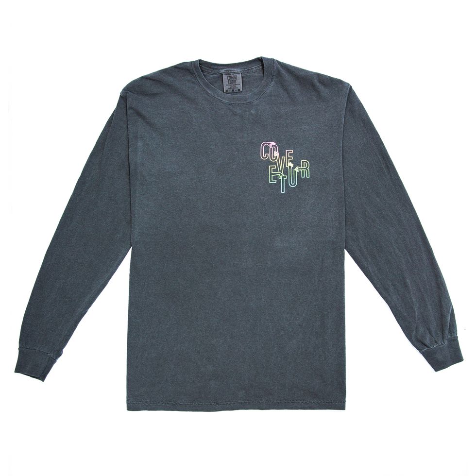
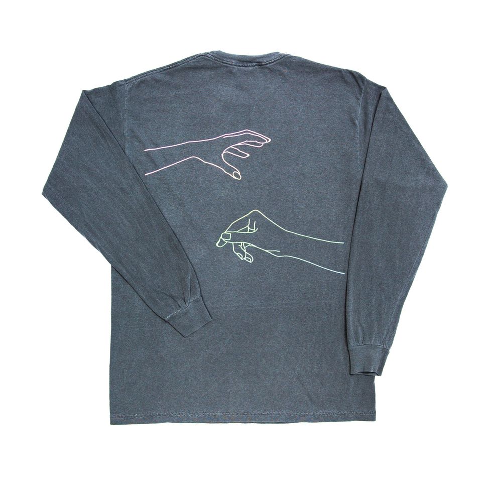
On his design for Coveteur’s new merch:
“To covet is to desire—more specifically, to desire something that belongs to another, which is a complex sentiment to interpret graphically. With its religious undertones (the breaking of the Tenth Commandment, no less), the concept of covetousness weighed heavy, but in the end, we found that a playful solution was the best fit. A juxtaposition of clean, sans-serif letters and manicured hands, with each grasping desperately at the next.”
On if he feels he has to compromise his style when working with brands that already have such a strong presence:
“It’s a bit of a balancing act. If you work with a company like Calvin Klein, for example, it’s only ever going to go a certain distance in one direction. It’s always going to be very monochromatic. If you’re working with type, it’s always going to be very geometric, very clean, very smart in look. So it’s more about finding interesting ways into that—how can you work within those parameters, but still try and bring something new to it.”
On living in New York City:
“The city’s probably inspired some of my best, most fun personal projects. I did a project in 2015 where I rode all 27 of the city’s subway lines, and I swabbed the handrails and the seats—I drew the letter and the number line in bacteria swabbed from the subway. And I’m still dining out on that project. That really blew up for me. I think it’s scratched an itch that most New Yorkers have, that they’re constantly surrounded by filth and germs. New York magazine did a double-page feature on it, and Wire did eight pages on it. I’m still getting asked to talk about that.”
The advice he has for young or emerging artists in the digital age:
“Focus on the ideation aspect. You have to know how to come up with a good idea. You have to accept that change is inevitable. I think designers, we pride ourselves on moving things forward and changing. But really, we’re actually pretty conservative. Whenever someone rebrands, we all just pile on about how much we hate this new rebrand or this new icon. The whole model of the industry is shifting into more equity arrangements—you have to qualify yourself. No one’s going to give you a slice of their company for a nice logo.
“You can get a $5 logo; it may be horrible, but you can get it. Even medium-sized companies use Squarespace templates, Shopify templates, and that’s the norm now. So those sort of aspects of design, those nuts and bolts, the things you actually produce, they’re not the reason that you’re valuable to a company. The reason you’re valuable is through your insight, through your knowledge, through your experience. Through knowledge of bringing products to market, that kind of thing. The ideas that you bring, that’s what’s really worth the money now, versus the actual end product.”
Want more stories like this?
How Adam Hunter Designs Some of the Nicest Interiors in the World
10 Fashion Brands That Are Taking Sustainability to the Next Level
We’re Calling It: Homebody Style Is the Next Thing