Step Inside This 1880-Era Arts & Crafts Home in the English Countryside
Think vibrant colors and lots of country charm.
There is something enduringly romantic and cinematic about the English countryside. The verdant landscape combined with quiet streams and flocks of sheep makes it an idyllic place to live. So when London-based interior designer Pandora Taylor was tasked with the renovation of Hadham House, an Arts & Crafts family house in the Hertfordshire countryside, she left us no choice but to pick her brain for all the details on how she approached the project and ways to emulate this tranquil aesthetic.
“The home is a Grade II listed old farmhouse commissioned by the Duke of Salisbury for one of his farm managers in 1880," Taylor shares. “It was built in the Arts & Crafts style, which was a movement made popular around the turn of the century by English designer William Morris." Identifying characteristics of homes built in this style include long, sloping roofs and asymmetrical architectural design. “A real statement against the elegantly regular neo-classical-style buildings popular in the 19th century," she adds.
Taylor's main goal was to bring cohesion to the property while preserving its history. “Some areas hadn't been redecorated since the '60s, whilst other areas, such as the kitchen, were only 15 years old," Taylor explains. “Because of this, there was a real disconnect throughout the house, and the clients wanted to create a more cohesive design that reflected the age and aspect of the property whilst also being fresh and uplifting." The other main goal of the renovation was to mirror the client's favorite hobby. “They're a keen gardener, so the house is surrounded by beautiful grounds as well as a wild meadow," Taylor says. “When choosing colors and fabrics, they wanted to be able to see some of these views reflected in the house, creating a warm and vibrant interior."
The home's layout has a “natural hierarchy of spaces" that includes tall, grand rooms and smaller rooms with angled ceilings. “I love this combination; it means you can play around with different styles to suit each space, creating a different atmosphere throughout the house," she says.
The kitchen is the newest part of the home, an extension constructed about 15 years ago. “When the clients originally built the kitchen, everything was painted white with pale joinery and flooring," Taylor explains. “Because this is quite a large room with a lot of natural light, the overall effect was slightly cold and impersonal." She remedied this with Farrow & Ball's "Vert de Terre," a muted green hue that's cozy and not overpowering. The cabinets are a cream color, which pops beside the green. “It has enough depth to create that feeling of bringing the walls and ceilings in, which was important in a room that felt too open and cavernous," Taylor notes. “It also picks up on the greens outside, making the space feel more sympathetic to its surroundings."
Glass vases and vessels bring country-house charm into the kitchen, as do the patterned blinds. “This spatterware bowl was from Italy, and the hand-blown glass jug on top of the cabinet was from a junk shop in France," she shares. “We also found this beautiful Soane fabric with its hints of pinky red, which we brought out even more with the blind trim." The subtle floral pattern helps soften up strong architectural lines of the room, “whilst not being too chintzy or old-fashioned."
The main goal for the study was to declutter. “There was a lot of furniture in here originally," Taylor says. “When we redesigned the space, we placed the desk here first and designed everything else around it." The desk is an antique and a focal point for the room. “The client wanted a vintage Ray Eames desk chair, so I thought it would be interesting to combine this with an antique partners desk," she says. “The room is also really big, so it could take such a large piece of furniture." Taylor slotted in several existing pieces from the client's own collection to accentuate the space. “We wanted to make sure the client had somewhere they could display their wonderful [collection of oddities], so we introduced a glass-fronted cabinet in the corner," she says. They also had several art books that needed a home. “I really struggled to find a beautiful book stand that wouldn't look out of place with all the other lovely things on the desk, so I designed one for them," Taylor says. “It is made of solid pippy oak and antiqued brass."
The objective for the hallway was to “make it feel more like a proper country-house entrance hall that would welcome their guests in and reflect the grandeur of the downstairs rooms," Taylor explains. The antique bench was a relic inherited by the client. “Luckily, it was the perfect size for the space. The rich, worn oak creates such a lovely contrast to the tiled fellow and plain painted walls and immediately reminds the visitor they are in an old house," she says. “Above the bench is a large blank wall, which lends itself so well to a big tapestry." Taylor turns to tapestries to add depth, and this particular one was commissioned from Zardi & Zardi. “They are a fantastic company who restore antique tapestries and from this have created a textile business where they digitally scan real tapestries and print them on linen fabrics and wallpapers." She used Amtico tiles to mimic natural stone, which coincidentally was quite practical for the client's family of five plus a “boisterous dog."
The bedroom hadn't been redecorated since the client bought the home; the color scheme was originally pale pinks and greens. “The room is really big and has a lovely bay window letting in lots of light, so I felt we could go a lot darker in here," Taylor says. “I wanted it to feel like a welcoming cocoon, a space where you just come to sleep and nothing else." The client already had the antique French-style furniture, which Taylor explains “helps balance the soft rococo lines." Taylor painted the furniture a whiter shade, “as the original color felt very yellow against the new color." The delicate floral pattern on the curtains helps balance the strong walls. “They speak to the more feminine lines of the furniture, creating harmony in the space," she says. There are also a few other prints incorporated into the bedroom. “By using different patterns all in shades of blue, we ensured the elements appear cohesive. When designing a room with a bold overriding color, it is important to have pops of contrasting colors; otherwise, everything will feel flat," Taylor advises. “This is why I love these two collages by artist Hormazd Narielwalla; they bring this lovely contrast of mustard-yellow tones, which we picked up on in the bedside table lamps."
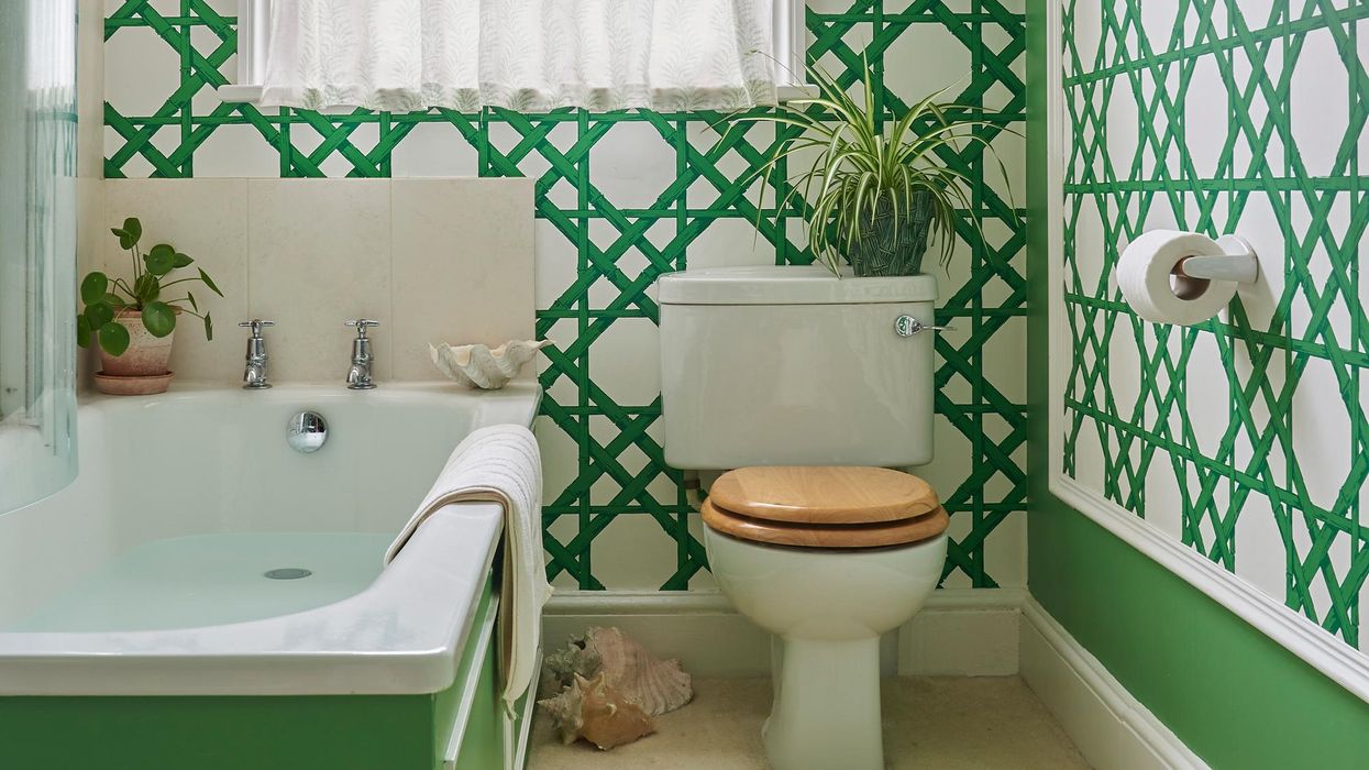
The bathroom was inspired by old orangeries and Victorian greenhouses. “This amazing wallpaper was just perfect, the green is such a happy green," Taylor says. “It can be a tricky color to design with, as it can often be hard to balance with other greens, but thankfully I found the perfect paint color to use with this, Emerald Green by Farrow & Ball in partnership with The Natural History Museum." Other striking features include the Dado Rail molding on the bathtub, which was introduced to balance the sloping ceilings. "In order to make some sense of the space and make it feel more inviting, I introduced this Dado Rail at the height of the lowest point of the wall, which goes around the whole room," she says. “So whilst you still feel the space provided by the tall ceiling, your eye is naturally kept within the lower levels of the room, making it feel more cozy and comfortable."
Photos: Mike Garlick
Want more stories like this?
This NYC Apartment Will Teach You Not to Be Afraid of Color
Inside the Nolita Apartment of Celebrity Stylist Cristina Ehrlich
Is Your Home in Need of a Seasonal Refresh? We Have Some Suggestions