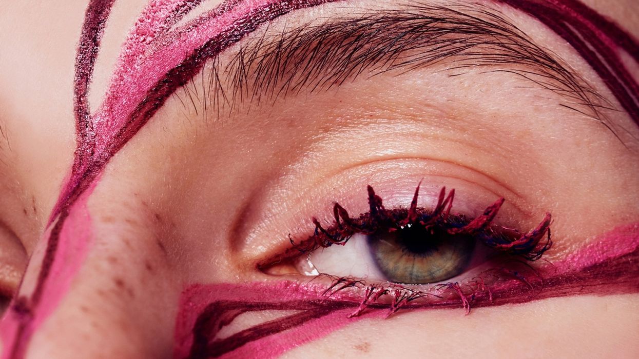
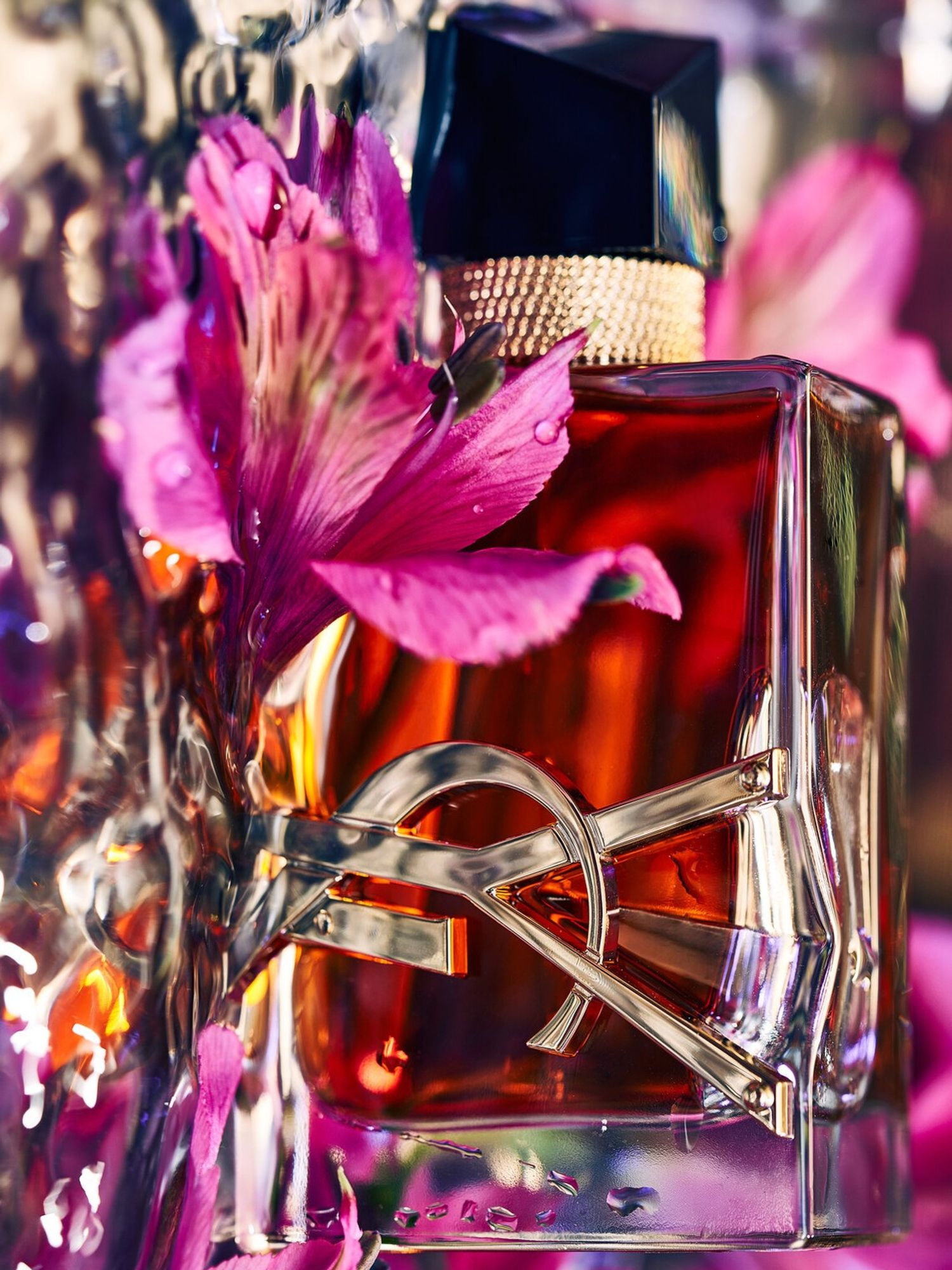
If you know nothing about photographer Fernando Gomez’s work, a click into his Instagram (a modern-day artist’s portfolio) and one thing is evident: a penchant for saturation. Color abounds in inky indigos, shocking scarlets, and ostentatious oranges. Gomez, who shoots largely still life and beauty imagery for brands like Loewe, Dior, Chanel, L’Oréal, Maybelline, and more, spends what he dubs a “couple of good full days” per month meticulously arranging his feed into a rainbow step-and-repeat of his photography. Ironically, his day-to-day life is mostly void of pigment.
His Barcelona home is all white. He dresses primarily in an array of black and white monochrome. “I'm kind of an old guy in a young person's body, so my whole thing is super minimal,” he says. He conflates this taste for muted colors with his more serious personality. "Colors are like therapy work,” he explains of his process. “Working with different colors allows me to explore different emotions in an introspective way.” Ahead, the artist walks us through his career trajectory, his approach to color, and his other hobbies, including a fondness for the outdoors and a voracious appetite for reading.
Courtesy of Fernando Gomez
Coveteur: I'd love to take you back to the early days. Who were your early icons, or the first pieces of art or photography you remember speaking to you?
“I wasn’t brought up in a family that was very art-focused, to say it bluntly. I think this photographic and artistic feeling started developing in my university days. I'm a self-taught photographer; I started in law. During law school, I had a lot of free time during the day. I started exploring while traveling through Europe with my then-girlfriend, now wife. Once you start going to the museums, exploring all these places—whether it's Italy or France—that have a lot of history and scenery, it broadens your mind. For reference, my hometown has a really great history. It has things from 1,000 years ago. But if you grow up there, you take it for granted.
The only thing that I knew about photography when I started was that you could do weddings. In my hometown, there's no such thing as a fashion or an art photographer. At that time, my biggest discovery was probably the work of Steven Meisel or Herb Ritts. That blew my mind. ‘Okay, so not only can you do fashion or still life, but you can be artistic about it. You can do things that are out of the box that do not have a commercial path.’ I still have a Herb Ritts book that I really, really love about his still life. It’s my go-to reference when looking for some of the really simple, but very magnetic images that make up my work.
When I went to the Louvre for the first time and discovered these impressionist painters, their use of color ignited me to do something more focused. At the beginning of my career, I didn't know what I was doing. I was just taking photos for the sake of taking photos. And then, of course over the years, I started focusing more on this colorful world that now populates all my work.”
I know so many of these things are very subconscious. You're probably not talking through them in your head, but what is it about color that gets you? How do you assign a palette to a project?
“I think that sometimes the photos speak to you in a way when you get to set. Maybe you have a conversation with the set designer. I'm a very collaborative guy, so I'm always open to working with our directors or set designers, or any of the people that elevate this colorful work. Also, I'm not working on a blank canvas. I'm often working with somebody who approaches me with an idea, with a project. When I'm doing something on my own, it's about the elements I'm photographing, whether it's flowers, cosmetics, or a person—but not in a portrait way, more in an artistic way. I'm not set in a color per se when I start.
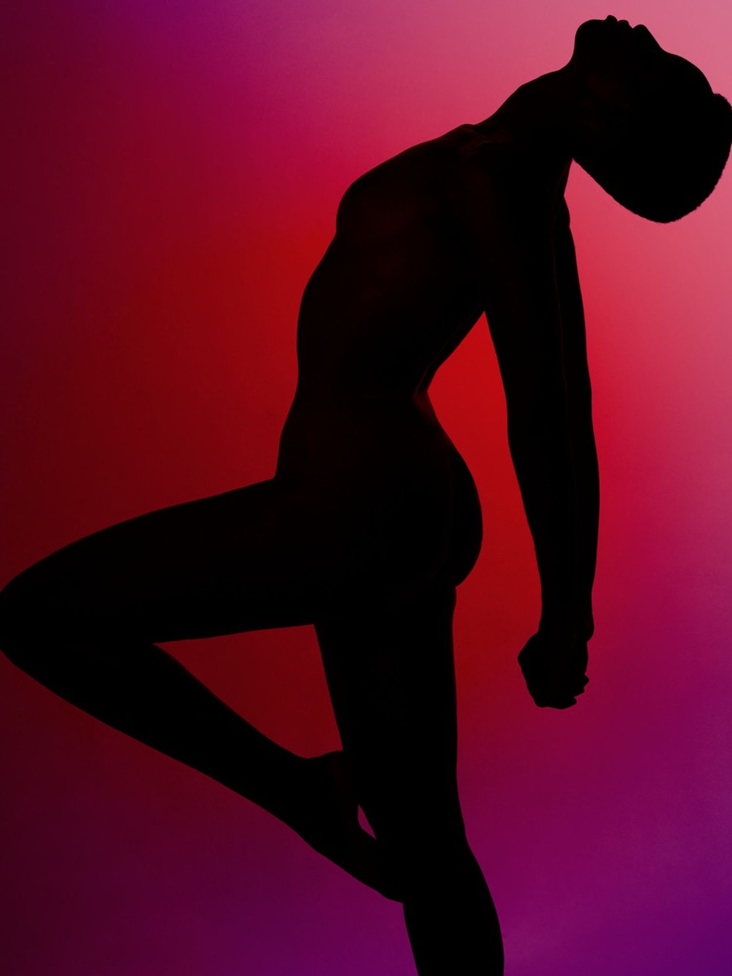
The light of the day or some small element can dictate what I do. Sometimes, I'm set in a color when I'm shooting—let’s say, dark blues or whatever. But then, I come back to the photos a day or two afterward and say, ‘You know what? I think this is more of a pink mood.’ Also, the skin of the people that you're shooting is important. I've been doing these artistic nudes with girls that are predominantly black, and I think the melanin of their skin works with some of the more saturated colors. And when I'm working with a Caucasian model, I always go with dark yellows or dark pinks. I'm a very fast shooter. I know at the third or fourth click: ‘Okay, we have it.’”
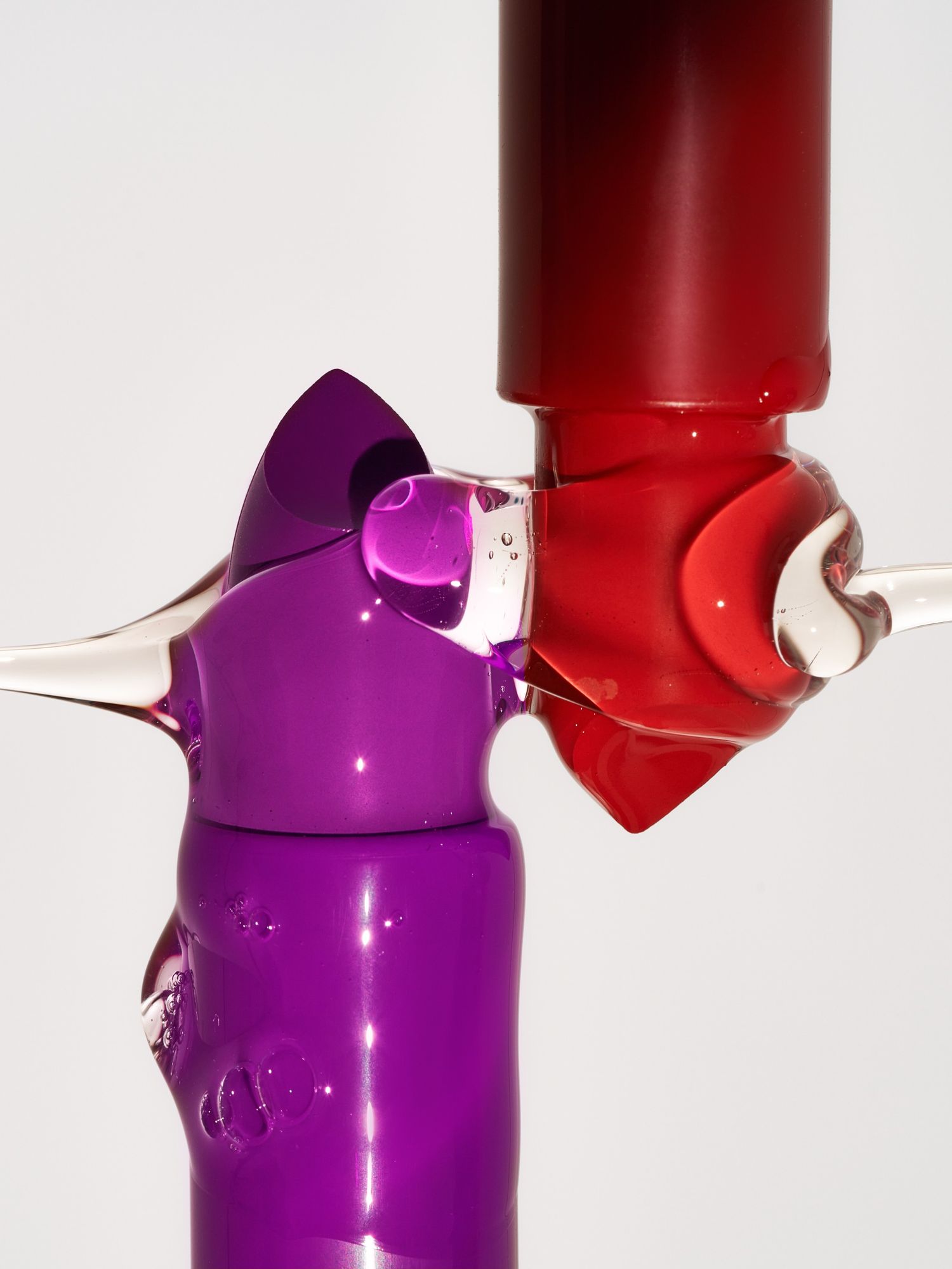
Courtesy of Fernando Gomez

What about the rest of your life? Is your life saturated, or do you live with less color?
“Not at all. I started wearing color, like, 10 years ago. I've always been a very black-and-white person. My house is all white. I'm kind of an old guy in a young person's body, so my whole thing is super minimal, super black and white. I love very muted colors; my personality is more serious. But when I get to work, and I get to work with color, it's like the rainbow opens up. My family doesn't really understand how I can project something that's so colorful when, in reality, I'm the opposite. That's something that I really haven't figured out. Sometimes, I think that the opposites, in this sense, make it work in a more interesting way.”
There's so much conversation around the emotions that are associated with different colors. Red is a fiery, angrier color, and green is more serene. Does that cross your mind at all?
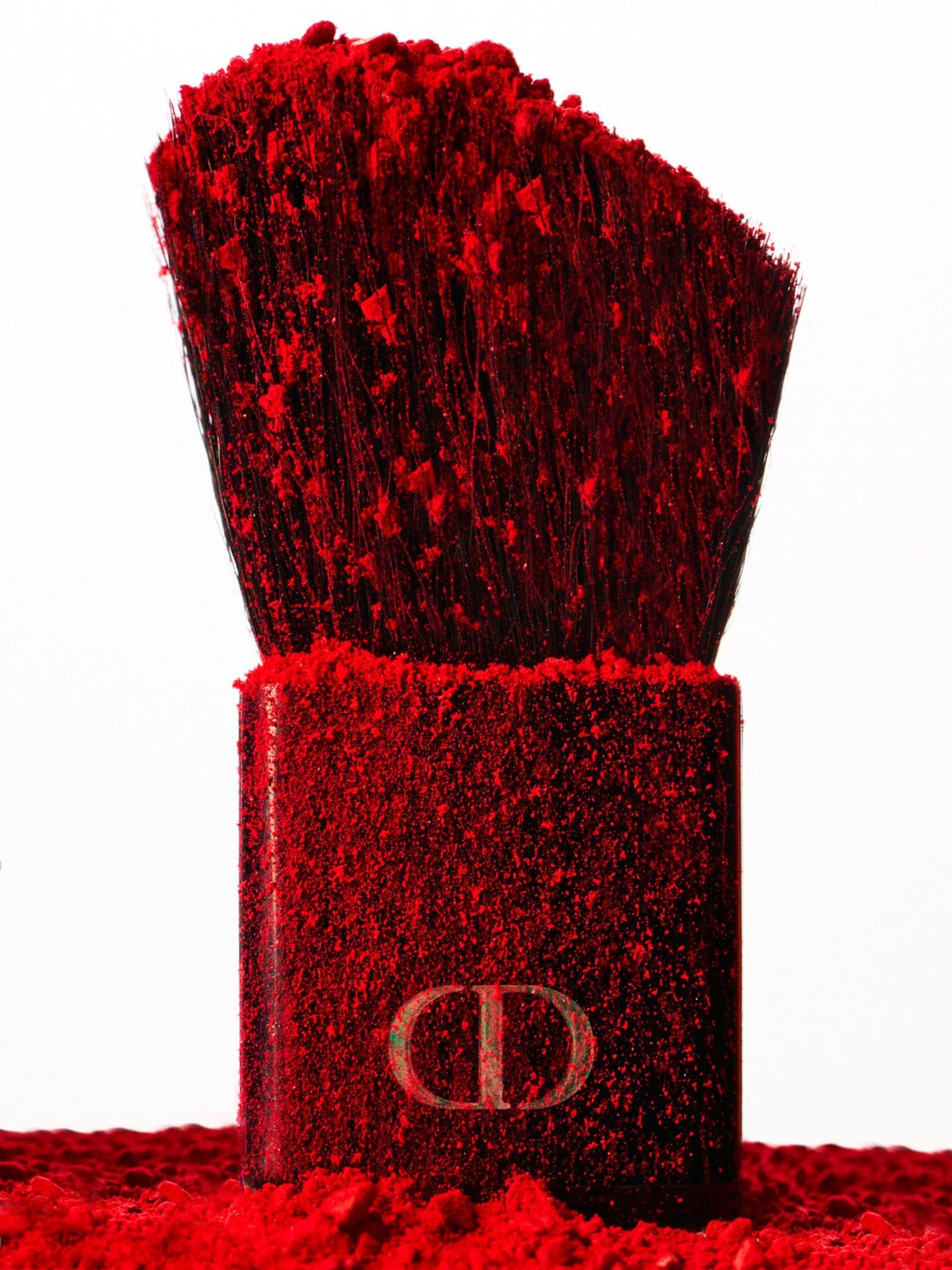
“It's true that darks are more intense, like reds or the blues. What I'm feeling at the moment also informs the work that I'm doing, especially when I'm editing. Red is probably my most satisfying color to work with because I work a lot with cosmetics and red is very intense. It's easy to work with because, for me, it's very pleasing. But I am always open to experimenting. I’ll go to my website sometimes to see what I've been doing. Maybe if I have too much of one thing, I try to steer away and go a different direction. But sometimes the mood you’re in when you're working spills through the final outcome.
That being said, I like to start with the primary colors—reds, blues, yellows—because from there you can get a million gradients. If I’m doing reds, I wouldn't go to blues, but I probably will go purple. When I'm doing my Instagram, for example, which is very color-oriented, I always struggle going from red to browns, because I rarely work with browns, but I do work with yellow. That's when I realize emotion is connected to the color for me. Once I start reviewing my archive, I notice that there's a pattern. I'm more inclined to dark, muted colors, but very saturated. It's something that I'm really trying to keep in mind when I'm shooting personal work, to say, ‘Okay, maybe I should shoot something dark brown.’ But then I go back to the editing room, and it's like, ‘No, it's not working. I should go back to the reds and purple.’ It satisfies me.”
I don't know if you've heard them, but there are English expressions like 'feeling blue,' or 'seeing red.'
“Yeah, I don't associate that with my work. There's, of course, what you said about fire being red, or intense, or this kind of passion. But, I think for me, colors are more like therapy work. Working with different colors allows me to explore different emotions but in an introspective way. I think emotions inform what I'm doing at the moment, but it has nothing to do with what I want the image to feel.”
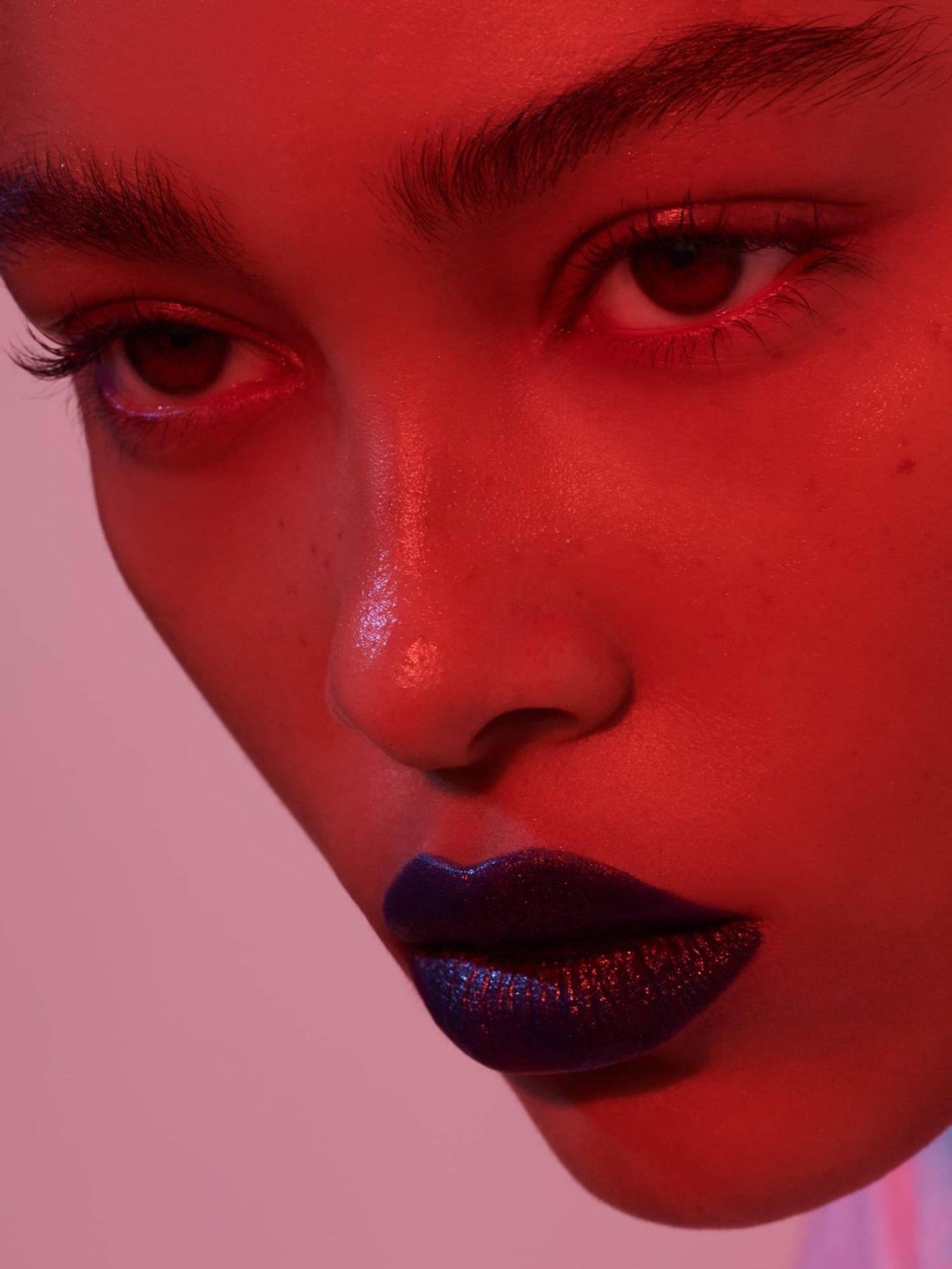
Yes, much less literal I'm sure. I find it interesting, too, if you think about color cosmetics, it's so much about pigment, whereas you think about skin, it's shades of neutrals essentially. How do you approach both, whether you’re doing them together or separately?
“That's very tricky, because clients ask me to shoot with models and still life. It's very, very, very complicated to make them work together, because of course, I'm always more inclined to color, but as you say, skin is neutral tones. I always try to create a dialogue with the clients, because with still life, you can do whatever with a pigment, and it will look amazing because it is so saturated and so rich. And of course, when you're shooting beauty, 99 percent of the time these days, it's very little makeup. For me, I show them previous works that I've done, and say, ‘Okay, so this is what you really like from my work, but you need to know that when I was shooting this, it was in a more freestyle way without having much constraint.’ You need to be super realistic as to what the tone of the actual model is. I always try to find these little tricks, maybe it's a play of light, so we can make them work together. At the end of the day, the cosmetic still life will be so saturated and rich that it will make the beauty shot seem very bland in comparison.”
It seems like a lot of your photos are quite stripped down. There's not a ton going on, so I'm sure there's a lot you want to control in the moment. Are you really only ever shooting in studios?
"Once I moved into the still life area, it changed the way that I was shooting. At the beginning of my career, I was shooting outside; Barcelona like is a full-on set. Generally, you have amazing weather, you have the beach. You can live super close to the mountains, as well. There are a million locations available to you. In my early years, I didn't even have a studio. As I started to move more into beauty, of course, you need to control everything. You need to control the light, you need to control whatever's happening around you.
My work started moving more inside the studio. Once I started doing still life, that was the end of the outdoor shooting. I love working with sunlight. For me, it is probably the best thing ever. Even in my studio when I have direct sunlight, I try to make the most of it. But I am comfortable working in the studio because, as you say, I can control everything. This has also given me a very safe net to know what I can accomplish in every studio, wherever in the world I’m working. That was something that I didn't find when I was shooting with natural light because Spain's light is very different, even from the north part to the south part.”
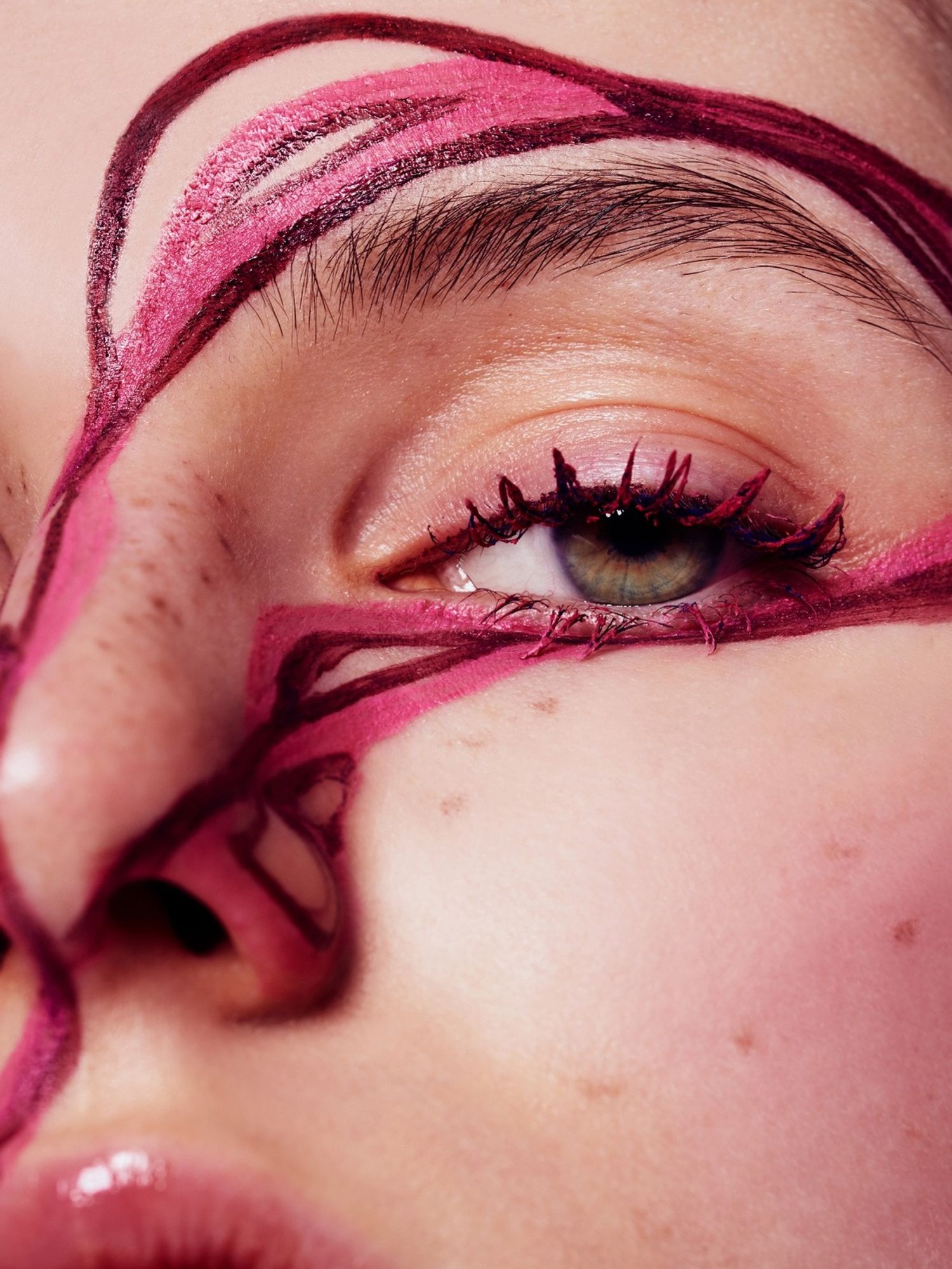
Courtesy of Fernando Gomez

In terms of visuals, what do you consume on a regular basis in terms of magazines, museums, people you follow on Instagram.? Obviously, it's research, but there’s also personal interest, I'm sure. What are your favorite sources?
“I have been going through different phases. This is going to sound ancient, but I was a Tumblr kind of guy. At the beginning, I was sourcing everything from Tumblr. When Tumblr disappeared, I discovered Pinterest, and that was the end of it, because you can go down the rabbit hole, and there’s no getting out. Apart from the internet, I love to go to the cinema. Getting into a dark room, being focused on something that takes your full attention. You can't reach your phone, and you have to just dissect everything. I was recently watching Poor Things, and I was just blown away by the photography.
These things make you look into what's happening behind the work of art. Apart from that, I like reading, because most of the time, that's what gives me ideas about different sets, some imaginary words or color palettes. I'm not from the school that you really have to have everything referenced, meaning that you need to work from a particular photo and evolve from that. Let's talk about the concept, and then we can get to something more physical. Sometimes it helps me more to take a walk and free my mind. I can stop by some place and see something small that ignites some ideas or some inspiration. Walking everywhere really helps me get inspired. I live a very outdoor life.”
Favorite books and films?
“I don't know because I read so much that I should probably keep a diary. My mother just got one for Christmas. I thought that was the most intelligent idea ever—this diary of books that you have read, and then you rate them. Also, I forget everything I read bookwise. I really like to read everything, whether it's an essay, a novel, or nonfiction. I'm open to everything because that's what keeps me very interested in different kinds of work. I would say the same about films. I don't have a favorite per se that I go back to, because I'm open to different kinds of cinema, whether it's indie or more commercial. Though I'm not a very big fan of The Avengers, for example.”
I'm shocked.
“Yes, but I'm very open to see everything, because I'm always of the idea that if you see a little bit of everything, at least you'd be able to just grab some small thing each time. I watch a lot of TV shows. Sometimes I watch something, and am like, ‘Why am I watching this?’ Whether I enjoy it or not, it's always informative in a way to just grab some ideas for next projects and such.”
What are you reading right now?
“I'm reading a thriller because I was reading some essays, and sometimes I like to numb myself in between. I know that I'm going to get very addicted, but I also know from the moment that I start that it's a murder, and then they're going to solve it, and it's going to be probably the least person you expected.
I’ve also discovered a new love for Japanese literature from Murakami, which is more commercial, but there are a million different authors that I really love reading, which is funny because I read them in English even though they're Japanese. I think I'm more open to reading in English rather than in Spanish. I don't know why but the English translators always get more about the feeling they’re trying to accomplish in these kinds of novels, which are very introspective and moody.”
Murakami feels colorful to me, so I get that.
“That was probably one of my first connections with Japanese culture when I was 18, 19. I haven't even thought about Murakami as colorful, but it's true.”
One silly question to wrap it up. How long does it take you to curate your Instagram feed? Because it's perfect.
“It takes me a long time. I have an ESD file, which I go back to every couple of days. I upload once a day. At the beginning, my agent was like, ‘No, you should upload only two times a week.’ And I was like, ‘Impossible.’ There's so much work to put out. I really want to feel the color grow. Sometimes I'm like, ‘I don't really want this red to continue.’ So I start working towards pink. I would say that monthly, I spend a couple of good full days on that. It's very therapeutic. I was just saying to my wife, sometimes I don't even need to keep working on my Instagram because I already have a layout. But, I love going back and saying, ‘Okay, I'm going to change this photo, because I found this new one that works better.’”
The collected works of Fernando Gomez are represented by Trunk Archive.
Want more stories like this?
‘Wall Talk’ with Australian Muralist George Rose
This Self-Taught Photographer Is a Believer in YouTube University
Personal Portrait: Na Kim on Designing Books and Making Art