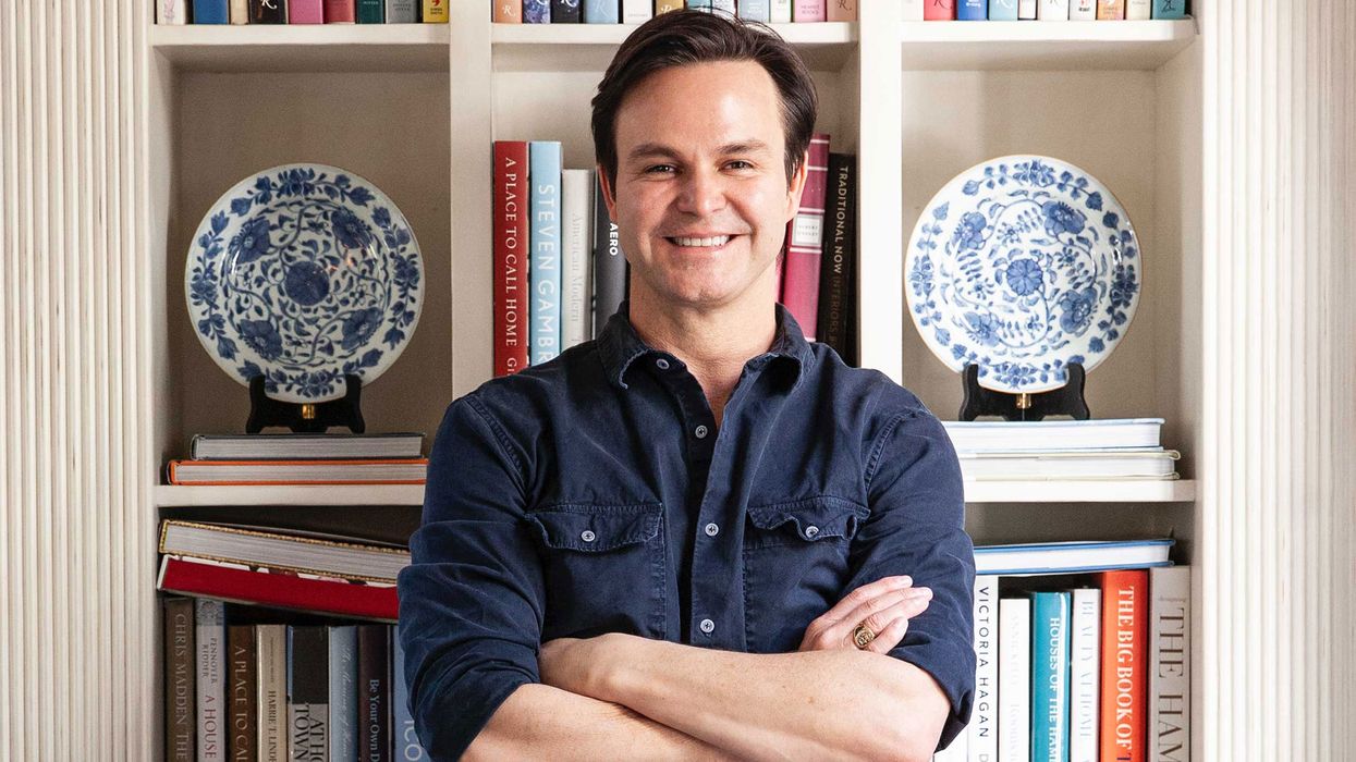
If you imagine all-American style, it’s not exactly far-fetched to conjure up an image of Mark Sikes clad in leather loafers lounging in his blue-and-white living room, but that’s purely surface level. Diving a little deeper, what does all-American style really entail? “I think true all-American design is really a mix of everything. That’s kind of how we define American style is a little bit of Asian, a little bit of English, a little bit of French, a little bit of neoclassical.”
It takes a seasoned eye to understand how to mesh all those seemingly unlike aesthetics into one, to pull out the aspects of each that will harmonize in someone’s home. Enter Sikes, a connoisseur of injecting traditional spaces with a magical dose of modernity that carries them effortlessly into 2020. Thankfully, he’s packaged his thought processes up and served it to the public.
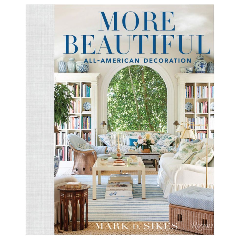
Sikes’ second book, More Beautiful: All-American Decoration, which launches September first, is a continuation of the story embodied in his first book (pre-order a signed copy here by 8/31, and you can virtually join his Beautiful Book Party). To say his first interiors book was a success would be a bit of an understatement, as it was not only a NYT bestseller, but the top-selling Rizzoli interiors book of all time. The book explores the power of beauty and the effect it can have on us. “[Beauty] is so subjective, but it’s really powerful. It can change your mood, it can alter your spirits, it can lift you, it can sustain you.
“There’s a lot of conversation in the book about personal spaces. Making things your own and being surrounded by the things you love is what really makes it a home.” This sentiment is more powerful now than ever as the country as a collective has never spent more time within the confines of our own spaces. We chatted with Sikes about ways to make your home look lived in and inviting by layering in texture, color, different influences, and so much more.
It takes a seasoned eye to understand how to mesh all those seemingly unlike aesthetics into one, to pull out the aspects of each that will harmonize in someone’s home. Enter Sikes, a connoisseur of injecting traditional spaces with a magical dose of modernity that carries them effortlessly into 2020. Thankfully, he’s packaged his thought processes up and served it to the public.
Sikes’ second book, More Beautiful: All-American Decoration, which launches September first, is a continuation of the story embodied in his first book (pre-order a signed copy here by 8/31, and you can virtually join his Beautiful Book Party). To say his first interiors book was a success would be a bit of an understatement, as it was not only a NYT bestseller, but the top-selling Rizzoli interiors book of all time. The book explores the power of beauty and the effect it can have on us. “[Beauty] is so subjective, but it’s really powerful. It can change your mood, it can alter your spirits, it can lift you, it can sustain you.
“There’s a lot of conversation in the book about personal spaces. Making things your own and being surrounded by the things you love is what really makes it a home.” This sentiment is more powerful now than ever as the country as a collective has never spent more time within the confines of our own spaces. We chatted with Sikes about ways to make your home look lived in and inviting by layering in texture, color, different influences, and so much more.
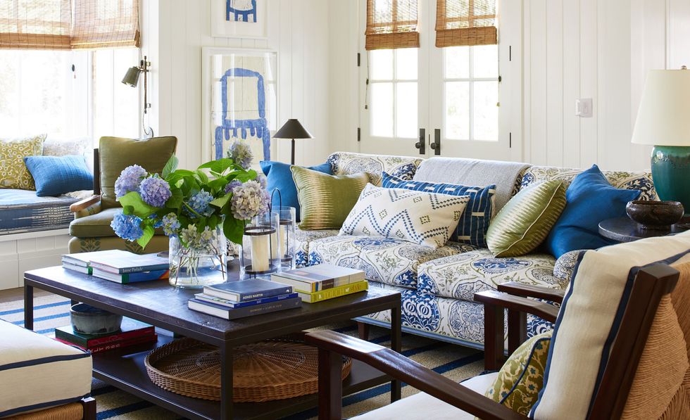 Photo: Amy Neunsinger
Other than blue and white, are there any new color pairings that you’re excited about at the moment? Anything that pairs well with those two shades?
“From a branding and marketing perspective, we’re known for blue and white. Of course, in our work we use most colors, but blue and white do go with everything. I’m really obsessed right now with chocolate brown with blue—chocolate brown with blue and really pretty caramels. I think it comes from the sense of people wanting to be comfortable in their space and wanting spaces to feel inviting. That just seems like a really comfortable palette.”
When you’re mixing prints, do you have any rules of which pair well together?
“Well, I always like to pick what I call a hero fabric for each room, which is more of a dominant fabric. That would mean maybe it has multiple colors or it has a larger scale. Then, I don’t know if my formula is the right formula, but I always like to mix a couple solids. I like to add a geometric, whether it be a check or stripe. I like to add a smaller-scale print that works with the larger print. It’s important to get a mix of things with a lighter background and a darker background. I just think it provides balance. I definitely love to throw vintage or antique textiles in the mix because I always think that gives the room a little bit more of a lived-in, worn-in, more layered feeling.”
When you are balancing colors with neutrals, do you have any sort of ratio you like to use to balance the two?
“It really does depend on the project and what type of house it is. There are definitely homes that call for a lot more color like traditional architecture. But then there are also places that call for things to be really neutralized. It could be a beach house in Malibu or a Mediterranean in Montecito. The house itself dictates a lot about the ratio of color.”
Does that approach differ when you have a larger space versus a smaller space?
“What I like to do in a smaller space is keep things more minimal. I love to take one fabric and just use it on everything. I think that’s a really amazing trick for a smaller space because it’s very stylish and very easy on the eye. Obviously, in a larger space you can do more layers of fabric because you have a lot more pillows and you have a lot more pieces of furniture. I do think, depending on the space size, your formula might be a little bit different.”
I know you like to add texture in your spaces. What are easy ways to do that, and what materials do you like to use?
“Natural-fiber rugs, abaca, sisal are always great for adding texture. I think layers are textural, like throws and pillows and things like that. We do a lot of custom lampshades now, which I also think is a really great way to add texture and dimension to space. Actual texture, pieces of rattan or wicker is always a nice textural add. Leather is also a nice textural add. A grass cloth, sea grass wallpaper, those pieces with literal texture are always nice.”
You do a lot of modern and traditional contrast. How do you balance that, and what are your favorite elements to throw into the mix?
“Well, I do think that’s just a recipe for a really well-designed room, having a mix of things. A mix of old, a mix of new, a mix of clean, simple, minimal modern things with traditional things. It makes rooms feel like they’ve been there a long time. I think modern abstract art is really lovely with more traditional furnishings in interiors. I also think cleaner-line coffee tables or side tables are also a nice minimal, modern mix, or like a really great modern light. I think those are really easy things to add into a traditional interior to give it a little bid of an edge.”
I know you also make a lot of cultural historic references in your designs. What locations do you love to pull interiors from?
“Well, I love the past in general, so I’m always drawn to and use inspirational pictures from the past to inspire new work. Whether it’s the beautiful interiors Horst photographed for Vogue many years ago, or legendary designers like Lorenzo Mongiardino, Billy Baldwin, or Mark Hampton. I just think the past is so informative on real style. Homes were much more stylish than they are today. There are some particular homes or people that I’m always drawn to the way they live, whether it was Lee Radziwill. I think there are also these fashion designers that had the most style and the most beautiful homes, [e.g.,] Oscar de la Renta, Bill Blass, Givenchy. I think that their homes were so evolved and such reflections of their style.
“Then there’s icons like Bunny Mellon, who spent her whole life curating an amazing collection, but not necessarily a collection of treasures. She really had her own style. She loved baskets and she loved shaker chairs. It wasn’t about the cost of things to her. She would have an amazing Rothko sitting next to a fifty-dollar shaker chair. That’s just real style, when you know who you are, you know what you love. That is what I’m drawn to personally.”
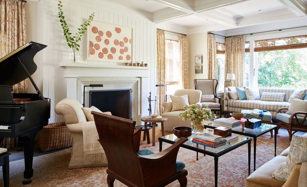 Photo: Amy Neunsinger
When you’re working with all these contrasting elements, how do you maintain consistency, especially when you’re working with a larger house?
“I do firmly believe that if you have a bunch of things you really love, you can put them in a room and they somehow work just because there’s this personal connection to them. I definitely think it’s about mixing things according to the scale and their texture and the contrast of light and dark, so I do think it’s a little bit of a science project in some way. I know now what works and what doesn’t.”
What are your tricks for making spaces appear larger than they actually are?
“I think keeping it super minimal. Maybe one fabric on everything, one color on everything. I do think smaller spaces always look better if there’s a lot more, I don’t want to use the word storage, but if there’s more cabinetry to disguise or house small, excess things versus having lots of little things sitting everywhere. In a smaller space, less stuff makes it feel bigger.”
What do you think makes a home/apartment look layered and lived in, not like you just moved in?
“Personal things, lots of books, magazines, flowers, plants. I think organic things as well as personal things are what make a home feel personal or lived in.”
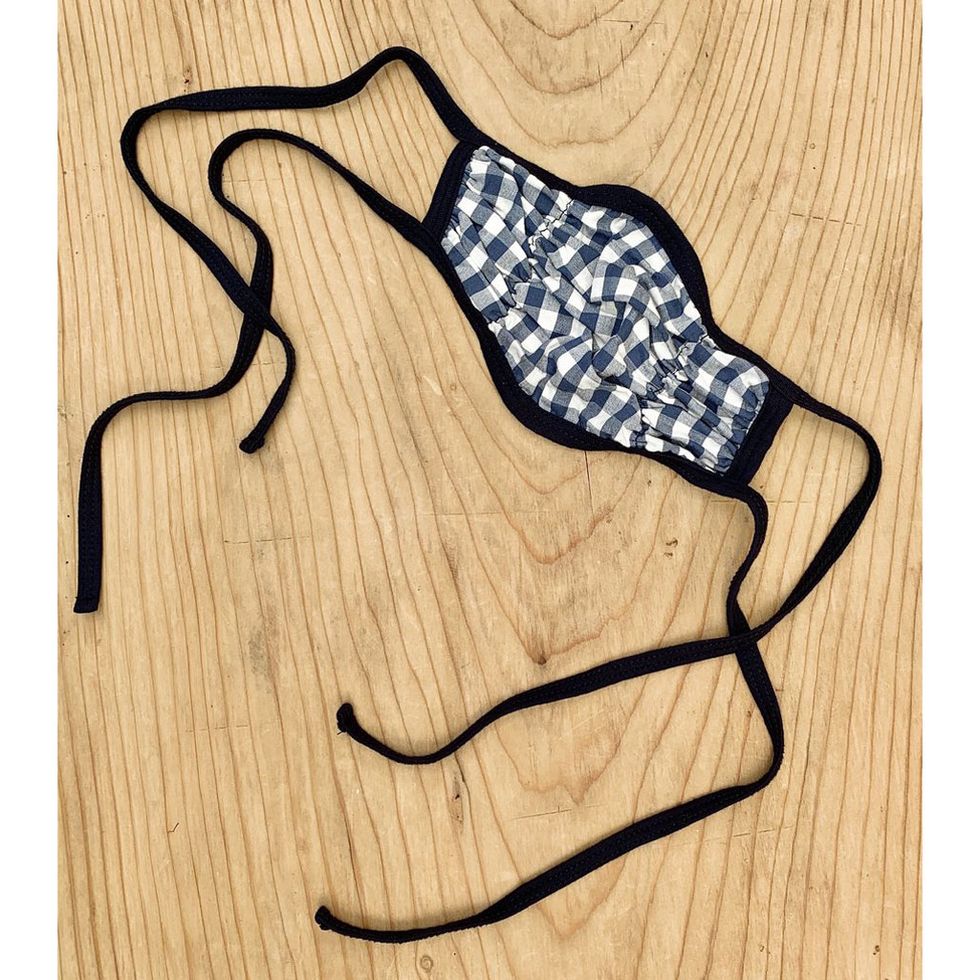
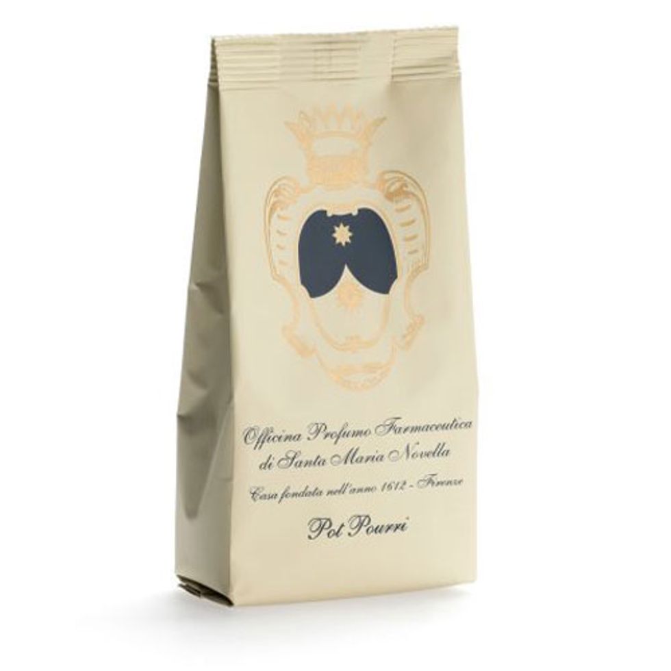
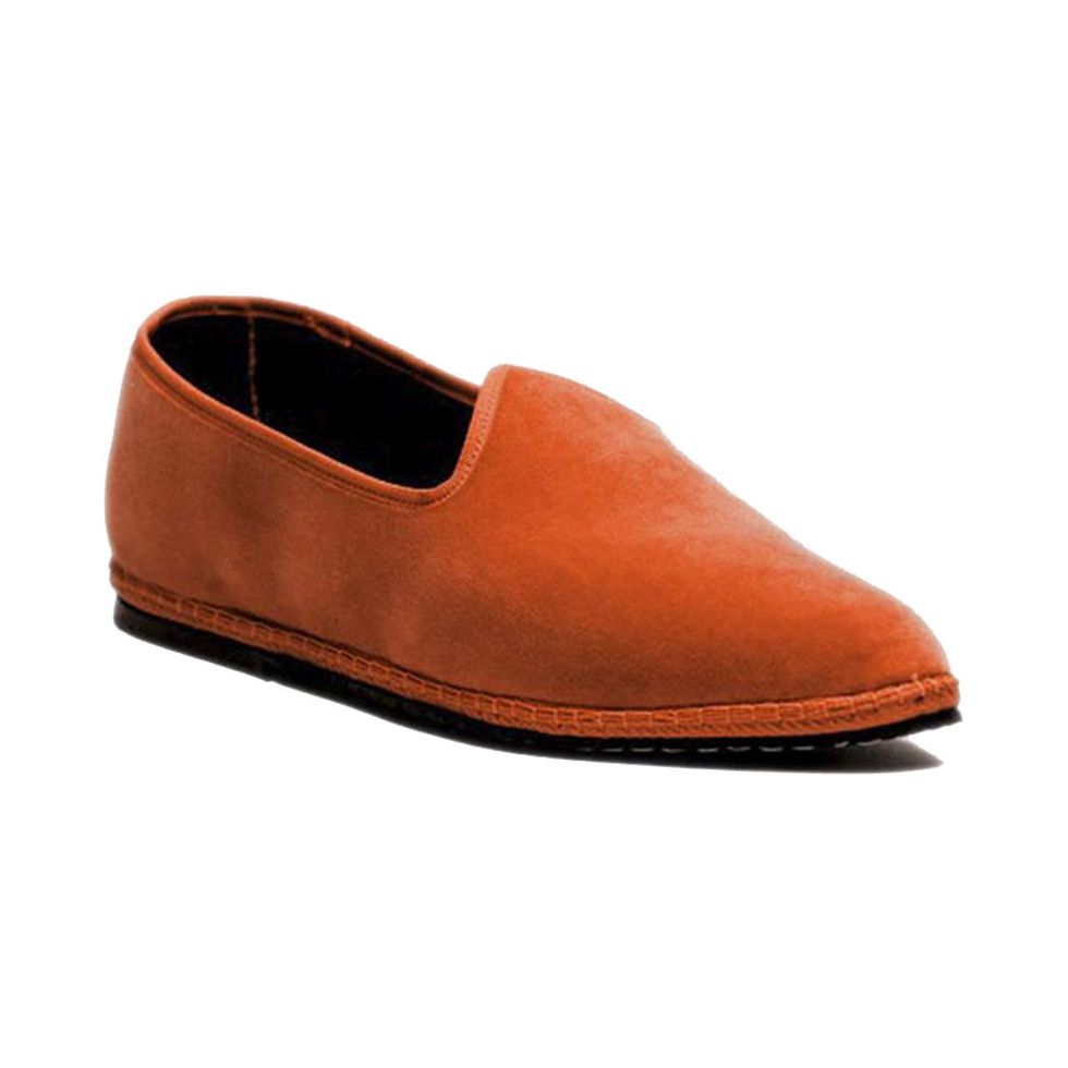
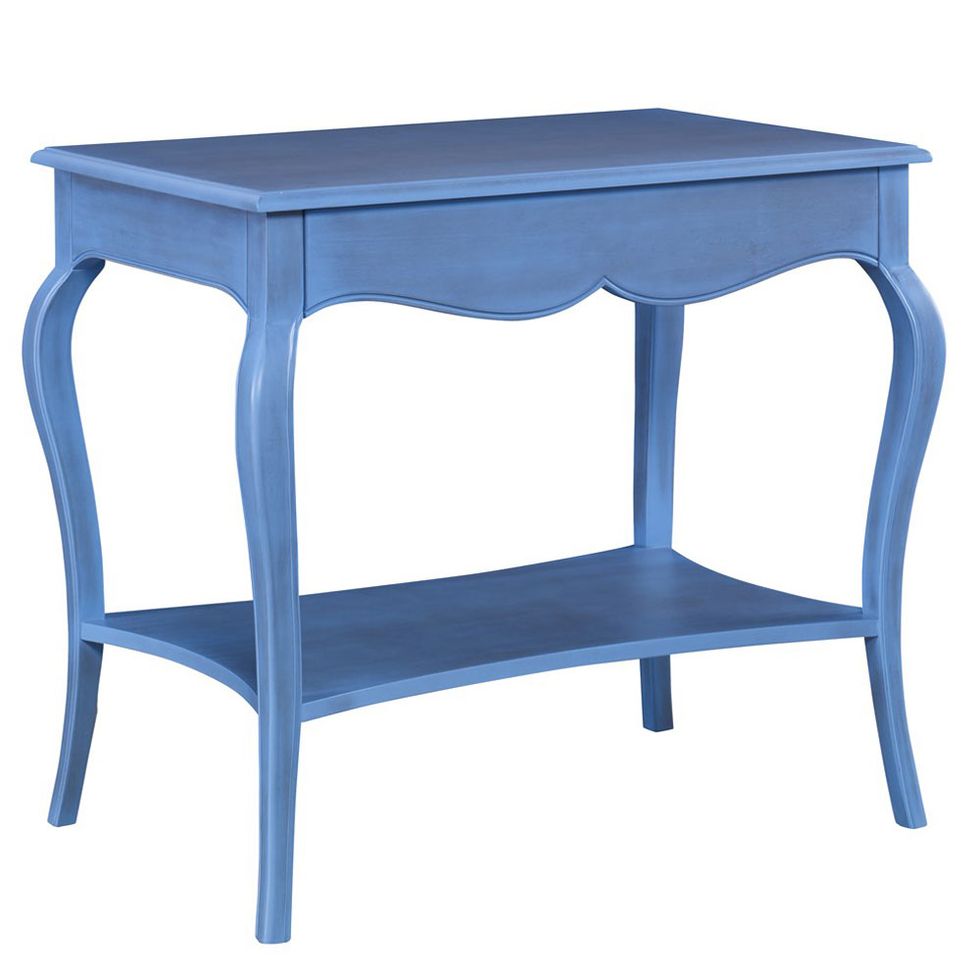
Shop Mark Sikes’ Interior Picks:

Photos: Amy Neunsinger
Want more stories like this?
7 Coveteur Staffers Share What They’re Buying to Update Their Homes
The Most Stylish Area Rugs for Every Budget—and Style
DIY Your Space with Home Design Guru MaCenna Lee
Want more stories like this?
7 Coveteur Staffers Share What They’re Buying to Update Their Homes
The Most Stylish Area Rugs for Every Budget—and Style
DIY Your Space with Home Design Guru MaCenna Lee