The Creative Director Who Dreams Up Hair Spray Names in Her Sleep
Amanda Wall is the one behind the uber-cool hair care packaging at R+Co.

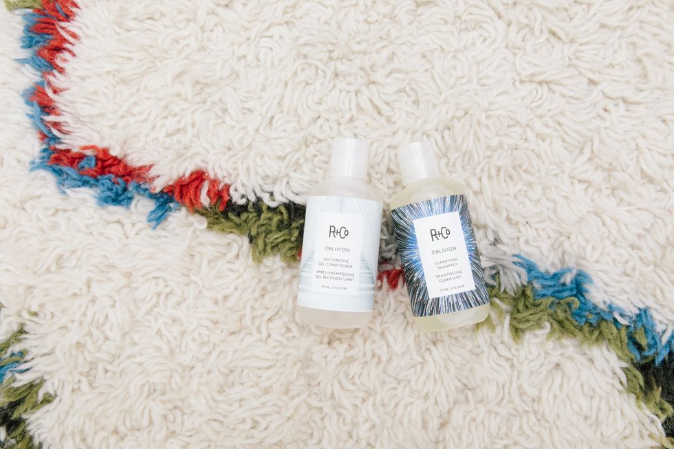
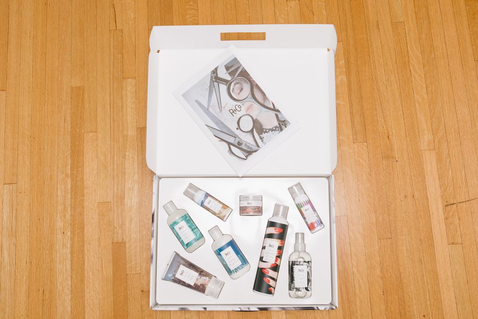
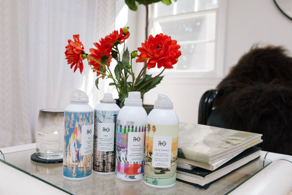
A fun game to play when you’ve finished interviewing Amanda Wall, the woman responsible for handling all creative direction and packaging design at R+Co, is to go straight to your beauty cabinet and pull out all your R+Co products onto the bathroom floor. Then marvel at the fact that she thought up each and every name and paired it with an original photo on the bottle that she and her team went out and took themselves. Like that Dallas Thickening Spray you use every post-shampoo for—you guessed it—Texas-style volume. Or the Death Valley Dry Shampoo that’s an ally when you don’t want to, you know, actually shampoo. And then all of a sudden that really cool hair care line displayed on your top shelf (because it’s too good to hide away in cabinets) becomes infinitely cooler.
Which is exactly what Wall aims for each time she dreams up a name (sometimes months and months in advance) for a new cleansing conditioner or styling paste. “It’s important for people to relate to it on some level, so it has more meaning than just another plastic bottle. That’s what builds a brand’s character,” she explained when we chatted. And we can definitely say that she’s built the best kind of brand character a cult hair line could ask for—from the time she joined R+Co and revamped their design approach until present day, she’s been harnessing brainpower and inspiration to ensure that all their products make you feel some kind of way. Because “no one needs really another bottle of shampoo.” Except when you see R+Co’s artwork-like designs out in the wild, you’ll convince yourself that you most definitely do.

How the switch from freelancing student to full-on designer at R+Co went down:
“R+Co is my first real job. Before that, it was mismatched freelance stuff. I went to school for interior architecture and design and was modeling at the same time. While I was modeling, I met Howard McLaren (one of the founders of R+Co), who at the time was working as creative director at Bumble & bumble. I started working with him after that—casting all his shoots, doing art direction, freelance work. He left Bumble and opened up this little pop-up boutique that was an experimental idea of what a salon should be. While I was helping with that, I started a kind of punk-rock modeling agency in L.A. It was pre-Instagram, and the people who wanted those kind of girls were artsy, cool brands who didn’t have money. So I made no money doing it, but it was fun. [Howard McLaren] and I were approached by Tev Finger, the CEO of Luxury Brand Partners, to oversee the creative direction of a new hip, cool brand called R+Co.
“When they pitched us the idea, they had already named it R+Co and had a packaging concept in mind. They showed it to Howard and me, and we were sort of like, ‘Um, this is really awful.’ I didn’t really feel like it had longevity. It was just more bottles on the shelf, and I don’t think anyone needs that. No one needs another bottle of shampoo realistically.
“I hadn’t done packaging or graphic design at the time. I told them I would go back and find someone to design something new. But in the process I had an idea to put photos on the bottles. Within a week, I redesigned all the packaging and gave all the products very individual personalities, names, and photos, pitched it to the entire team, and everyone loved it. So I accidentally got into packaging design.”

Her day-to-day handling all things ~creative~ (including thinking up unique product names!):
“On the day-to-day, I handle all the visual direction of the brand. I also name all the new products. I name everything based on the function of the product. It’s usually a cool, simple, fun name that feels engaging and has a character or an experience tied to it. After that, I find a great image that goes with it.
“The product name absolutely comes first—I have a very difficult process, because I go through lists of really great names, but they can’t be owned by any other beauty product ever. So I work to find something that works with the actual product and has a cool image that goes with it, so it’s time-consuming, but so much fun, too. I actually have in the notes section of my phone, there’s this big, long one of random words. Because I’ll instantly forget them if I don’t write them down.
“Inspiration comes from anywhere. It could be something I saw in a film or heard in a song. It’s also difficult now that Instagram is such a big part of people’s lives. I don’t want to say directly that Instagram is a reference, but it’s hard to not be influenced by a flood of things you see every day. I try not to get too fashion-y. I like landscapes and cities a lot because everyone knows what that feels like. I want it to be something that everyone can connect to on some level, and less of something that’s very specific to one type of person. So making it as broad as possible while still feeling cool and relevant.”

How R+Co manages to stand out in a sea of shampoo bottles:
“The difference between R+Co and other brands is that I want there to be an emotional connection. It seems like a bit much—I know it’s shampoo, but to me it doesn’t matter what’s inside the bottle. I could be packaging ketchup, right? I still want people to say, ‘Wow, that’s great, I have to have that.’ Not even based on the function of what’s inside, even though the product is really amazing. It’s important for people to relate to it on some level, so it has more meaning than just another plastic bottle. That’s what builds a brand’s character.”
Perks of the job (and that time she dreamt of hair spray for a year):
“I’m really given super creative freedom. Which doesn’t happen a lot, especially in corporations; there’s marketing teams that have specific strategies, and I don’t, which is really great. I have the opportunity to be imaginative in terms of what packaging can be, what inspires me and hopefully inspires other people. [My advice for others is] don’t compromise your creativity and aesthetic for more likes or followers!
“[Dream products] do come to me. Like with the red fingernails holding the can on our Vicious Hairspray. I had this idea in my head for a year before the product even came out. I was like, ‘All I want is a can with hands on it.’ I didn’t know what I was going to name it yet, but I just had this vision that it was going to be amazing. Things like that will come to me where I’m excited about a visual that I can put with a product, but I have to wait for the product to come out.”
Why the packaging is more like a personal slideshow of her life:
“In a lot of ways, it’s very personal to me. A lot of the clothes on the packaging are my clothes, and the hands are mine. Not necessarily because I want it to be a reflection of myself, it’s just convenient because we shoot a lot of the packaging ourselves. With Death Valley Dry Shampoo—we actually went to Death Valley and took the photo. We drove down Sunset Boulevard during the sunset for the photo on Sunset Blvd Shampoo. It’s almost part of my life in a way, like my own Instagram, it has that same connection.”